To help differentiate my product from others, I had a look at other examples to see how they function, and use CBT, this will then help develop my ideas further to know how to make my idea stand out, and useful for my target audience. This will hopefully inspire me with positive ways of designing, as the interface is very important.
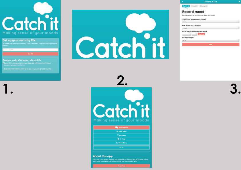
The first app that I looked at was Catch it. This company helps to track a person’s mood, and helps/ gives feedback to them. This is a good concept as it makes the suggestions specific to the user. However, this isn’t the most interactive design, I feel there could be more added to make it more friendly. For example, instead of having drop down boxes for answers, the user should be able to type it in themselves as, it helps to express their feelings more, and help them to feel that they are being understood how they feel. This is crucial for my functionality as, my research has shown that a reason to why a person may have a problem with mental health is because, they find it hard to express how they feel. The teal colour used is very calming and the font is bubbly, which I think helps to create the overall calming effect, which results in the look of the brand. From looking at this app, it has helped me to see that I need to make my app more interactive, with different features and depth to it, as each person will have a different experience and I need to accommodate to this for my target audience.
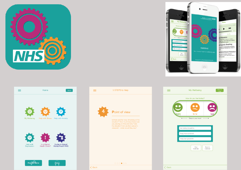
The next app I looked at was the NHS Well Mind. This is what they would recommend to go on when the user is not in consoling. The interface of this design is very simple and looks very out of date. The main home page does not look appealing to the user. Having an attractive layout is very important as it is what attracts the user to keep using the app. I think it is good that their main focus to help the user to find out who they should seek help from, but the way that they have to express their feelings is not very specific. It is just Good/Bad/OK, a human being feels more than these emotions. This means when developing my interface, I want to create a way that enables the user to express themselves more and be personal. Also, the colours that they use for the logo, are not calming. They are quite dark and not very attractive, doesn’t make me want to use the app. Applying this problem to my concept, I need to make use that my logo is interesting to the user, as this is what is going to help to make mine stand out from the crowd.
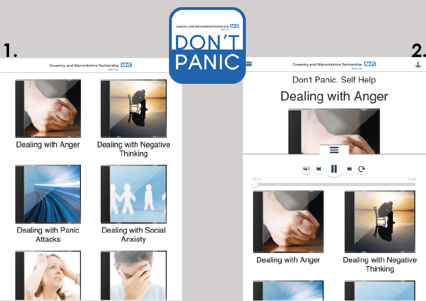
Don’t Panic is another app designed for the NHS. This one mainly focuses on how to deal with mental health problems. This would be fine, if the user wanted to find out an answer quickly, plus it has all the details and information that they need. However, the interface for this is very basic, and not pleasing to look at. As a result, the user will be put off by the design. This is an aspect that I would like to avoid, as making it appealing to the target audience is very important, with all the information they need. To help develop my idea I need to break down the information, to make is easy to read and easily understandable, with an appealing design. A good feature about this app is that instead of reading the information, it is someone reading it out to you. This would be helpful for the user as, it will be like they are talking to someone without the pressure of actually talking, which will help them to be a little more relaxed. This is a feature I would like to develop on mine, as it could help relax them, as if the user is suffering with anxiety then reading is the last thing they want, so by having someone talking you through something it can relax you more.
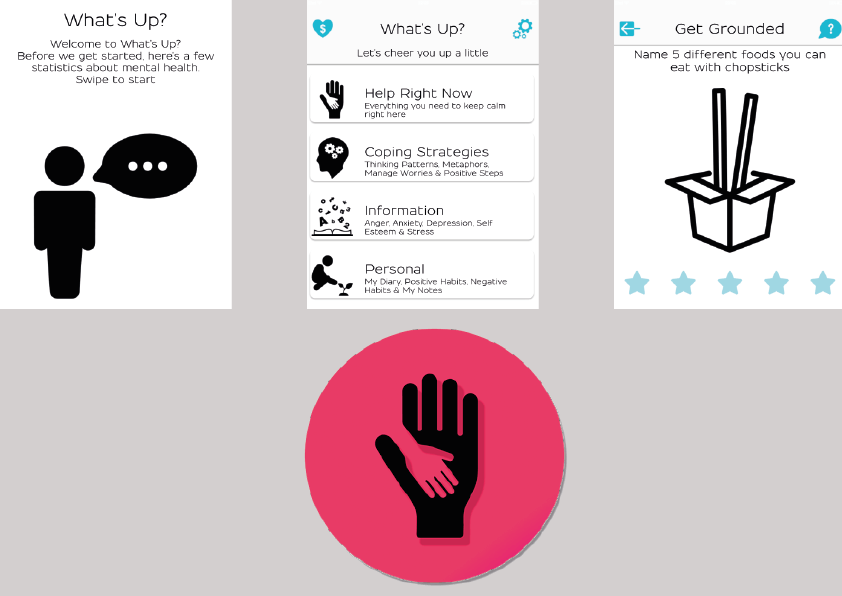
What’s Up has been recommended by a few physiological sites
The interface for the app has been layout nicely, clearly, and easy to read. This would be helpful when trying to organise your thoughts in your head, as their feelings at tough times can be hard to separate. However, it is also very boring, the illustrations are just in black and white, this doesn’t make it very welcoming for the user. The illustrations are simple and easily recognised. Moreover, to apply this to my project I would want to make the illustrations applying but also interesting to look at, which could be used as a distraction when trying to calm themselves down. I really like the logo as it is so simple, and suggests this app wants to help the user, like the hand is reaching out to them. This is an aspect I would like to incorporate this into my design for the logo as, it is the most effective way to communicate what I am aiming to do to the user, but I would like to use more calming and welcoming colours, as I feel red represents anger and warnings.
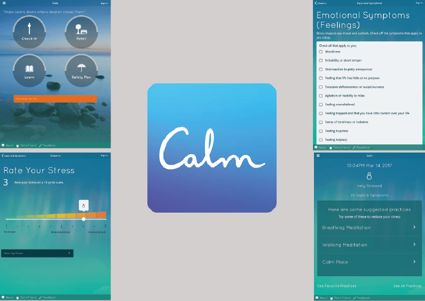
Calm is one of the most recent apps to come out about mental health, which makes it the most interesting and helpful to look at. This has the most modern design out of all the app I have looked at. I really like the interface, as they use a picture instead of a block background, and this is more effective with trying to reach the calming aesthetic. I feel it gives the user something else to look at, and can be used as a distraction to what they are going to. The connotation for this would be, that the app is the users “happy place”. I would like to aim, to convey this through my designs, because I want it to be seen in a positive light. The overall colours are blue and green gradient, which has a real calmness to it, as they blend easily together. The homepage buttons are nice as they are simple and easy to look at. They seem to cover most of the aspects that the user wants to know. However, again the functionality could be a little more interactive, instead of ticking boxes of how you feel, or swiping your finger to how stressed you are. When thinking about how my design is going to function differently from the others, interactive needs to be a key thought. Getting the user to feel more involved is very important, as CBT does not feel like a chore when they want to do it. It could become something they enjoy and will want to use, and positive thinking with hopefully come from this. The typeface used is appealing as, it is not in the users face like in What’s Up, but also make the person feel calm, as they look like little bubbles. This then contrasts with the font for the logo, as this is more handwritten style, again this does give off a calming ambiance. However, I feel that the logo looks completely different to the interfaces. To apply this to my project I would want to make sure that my logo fits in with the overall aesthetic.
https://www.ucl.ac.uk/student-psychological-services/index_home/mha
http://appstore.liv.ac.uk/catch-it/
http://www.dwmh.nhs.uk/wellmind/
http://new.covwarkpt.nhs.uk/dont_panic/Pages/default.aspx
https://itunes.apple.com/us/app/whats-up-a-mental-health-app/id968251160?mt=8
https://www.calm.com/