Research on interface design:
To ensure I create a modern interface design that is appropriate for my target audience, I looked in to the main aspects of design I need to remember to make sure it is user friendly.
Main focuses:
The structure – Design should organize the user interface purposefully, in meaningful and useful ways based on clear, consistent models that are apparent and recognizable to users, putting related things together and separating unrelated things, differentiating dissimilar things and making similar things resemble one another. The structure principle is concerned with overall user interface architecture.
How simplistic – The design should make simple, common tasks easy, communicating clearly and simply in the user’s own language, and providing good shortcuts that are meaningfully related to longer procedures.
The Visibility – The design should make all needed options and materials for a given task visible without distracting the user with extraneous or redundant information. Good designs don’t overwhelm users with alternatives or confuse them with unneeded information.
Feedback – The design should keep users informed of actions or interpretations, changes of state or condition, and errors or exceptions that are relevant and of interest to the user through clear, concise, and unambiguous language familiar to users.
Reuse – The design should reuse internal and external components and behaviours, maintaining consistency with purpose rather than merely arbitrary consistency, thus reducing the need for users to rethink and remember.
What are the main functions of an app:
- Notifications – We’ll need to push the new words to the user via a notification, so we’ll need an onboarding screen that asks the user to allow push notifications.
- Home Screen – The user should be able to purchase multiple different language lessons, so we’ll need a home screen where they can purchase these lessons and activate existing ones.
- Tracking Progress – The user should be able to see the progress of each lesson that is currently activated.
- Viewing a Lesson – the user should be able to see a list of the words they’ve learned so far in a given lesson.
- Viewing a Word – The user should be able to view words they’ve already learned. This should include the definition, image reference, the part of speech, audio pronunciation and link to conjugation.
What is the main information on the homepage:
- We want an element of gamification, so we’ll show their stats nice and big at the top of the home screen.
- Below the stats, we’ll show their current lessons, their progress, and locked lessons. We want to make sure that it’s obvious that these lessons are inaccessible. This will entice the user to unlock them every time they visit the home screen.
- I want the app to be very visual so I’m going to try and incorporate nice photography into each page.
- Since this is the home screen, the user should be able to go anywhere from here. To begin with, our app will offer some basic user settings, so we’ll make sure there’s a way to get to settings screen from this home screen.
The five pillars of interaction design:
- Goal-driven Design:You want to design for the right user. User research, such as surveys and interviews, will help you create personas for those most likely to use your app. This allows you to create specific goals for your users and tailor your app’s workflow to suit their needs.
- Usability: If your audience can’t easily use the app, then they certainly won’t download it from the App Store. Usability makes a productuseful, which is the first step in being
- Affordance & Signifiers: The affordance is the function. Signifiers hint at affordance. For example, blue, underlined text indicates that clicking on it will take you elsewhere. Use signifiers correctly so users don’t need to think about what each UI element does.
- Learnability:You want users to instinctively know how to use an interface. This is where design patterns come in handy, which we’ll talk about later in the article. Familiar patterns help a new user easily acclimate to an app.
- Feedback & Response Time: Feedback lets users know if a task was completed or not. It can be as simple as a beep, or more complex like a modal window.
When designing for a user I need to remember:
- Personas: Personas are fictional characters fashioned from the expected behaviour of your target users. They allow you to determine what will drive users’ decisions within your app.
- User Scenarios: Scenarios provide insight into how a persona will act. With user scenarios, you’ll be able to design a UI that best suits them and the goals they want to accomplish.
- Experience maps: Here you’ll explore all the possible conditions for a single interaction. Experience maps chart each step that personas are most likely to take while using an app. They help you understand all the emotions and circumstances that surrounding those steps.
The two categories for interaction designs
- Gestures:Touch devices are defined by gestures. Touch, swipe, double-tap, pinch and zoom are becoming second nature to users.
- Animations:Motion keeps users grounded in the UI while adding context. There’s a difference between elements that vanish and those that slide out of sight. The former is deletion; the latter is available for use later. When animations are combined with gestures, they add another depth to the experience.
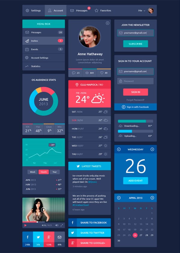
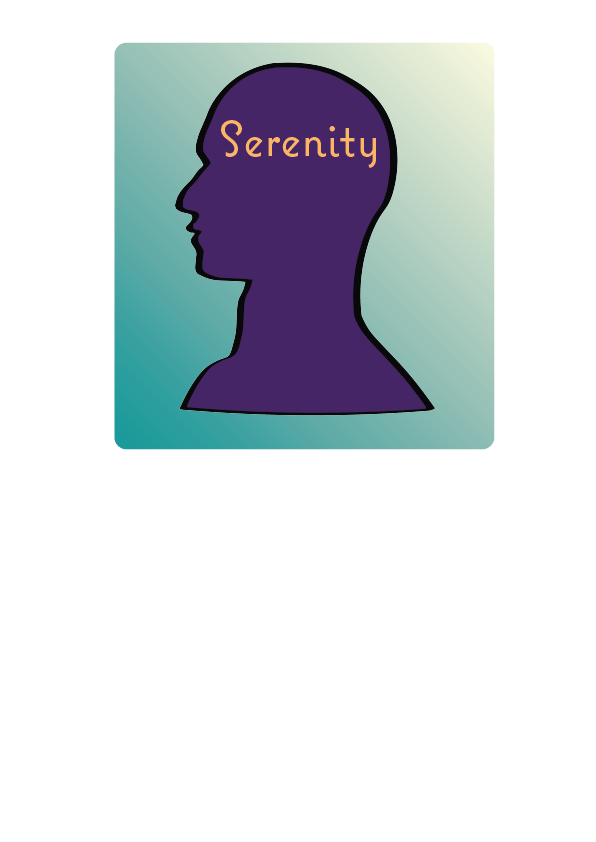
I really like the colours used in this design, it looks very sleek, and easy to follow.
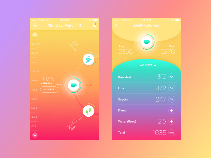
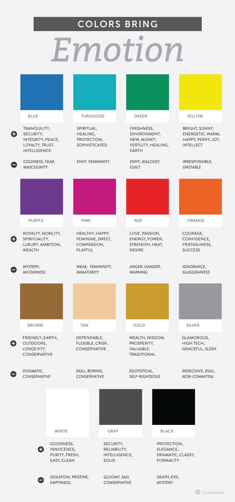
I really like this design, the gradient makes it look fun and attracts the audience to use the product.
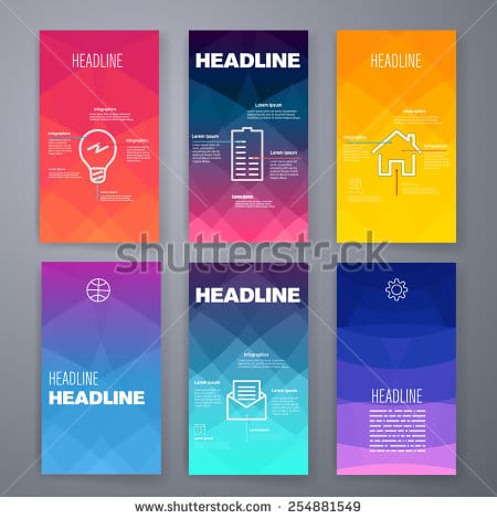
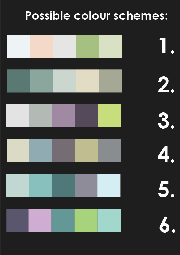
I like the geoprint in the background, I think this helps it look more modern and differentiates it from other app designs. I think I would like to use an interface like this as it will appeal to my target audience more.
Bibliography
https://thenextweb.com/dd/2015/07/01/7-tips-to-create-awesome-mobile-app-designs/#.tnw_I2CUmUO6

