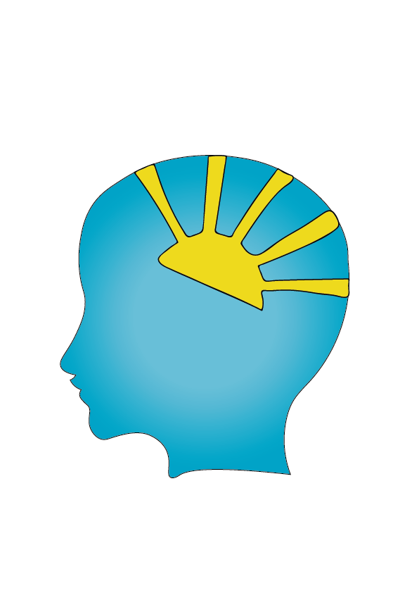
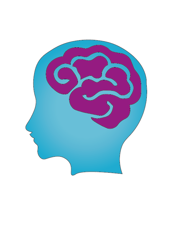
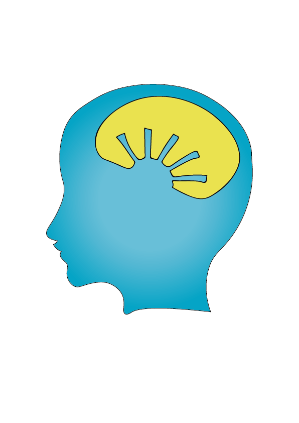
I carried on exploring different designs for the logo, and thought that the head was still a good idea. However, for this one I went with a different outline of the head. I do feel that this make it look more modern and was better than the previous head designs that I did. To make it look more interesting I wanted an object to go into the brain area. I first though what could be optimistic or thinking of more positive ways of thinking. For the first one I put a sun inside the head, as this has all the positive connotations to it. Also, I made it a half sun to make it look like a sunrise, so it links with new beginnings. However, my drawing of the sun isn’t very good as the sun beams are not even, and some are wonky. This could be improved more, by tweaking the beams so they are all equal and look more professional. The second on is a brain, this is a very simple representation of mental health, as it shows that this product with focus on the way that they think. I think the brain looks ok, but could still use some more tweaking. However, I feel that this is very boring, and not inventive, if you out this against other app logos then you would not notice it as, it will look the same as the others. From this I want to keep working. Lastly, the third one I designed, was developing on from the first one. Instead it is more of a silhouette of the sun in a brain shape. I thought that this was a cool concept idea, as it looks on positive thinking, which links to the CBT. However, as I got this from my first design, the sun outline needs more work and finessing, but also the outline of the brain could be enhanced more to actually make it look like a brain, instead of an oval shape.