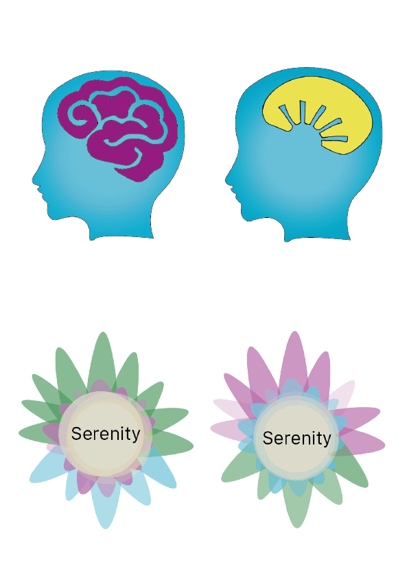
From looking at all my previous designs and asking my target audience, these were the best out of all of them. From this I know that I need to cancel it down further to just one design, so I can continue to develop it. Out of all of them I think that the one that has the most potential is the forth. When i decided this i then got more audience feedback on what could be improved. I got; the typeface need to be more aligned in the middle, the green of the petals should be the lighter shade of green, and the petals maybe should be more equal. I am taking their feedback on board and will continue to develop this idea further.