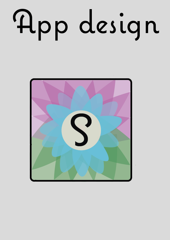
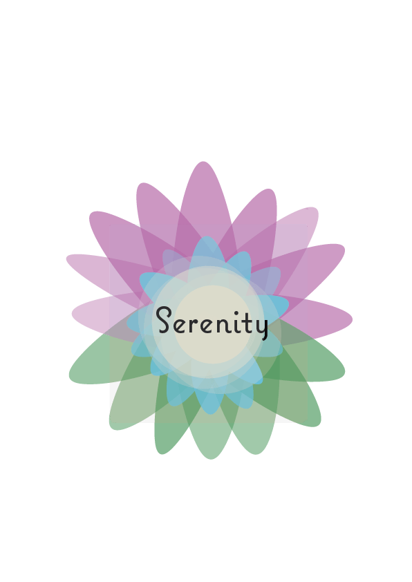
As I have decided that I am design an app, it means that I need to create an app interface that links with the logo and aesthetic of my design, as this will help to keep my branding similar. I knew that I didn’t want it to be the same as the logo, as I think this is boring as, is not what most companies do. They take the main feature/image of their logo or title and then develop that in to a app logo. For my project, I thought that I would focus on the lotus flower, as I feel this makes the app look different and more positive. When I started to develop my designs, I started off with the flower that I made for the logo, however when I put it in the app shape, there was a lot of random white space around the petals. I really didn’t like this as, it made the flower look really weird. My next step was to make the purple and green petals bigger. I feel this looks better that the first one, however, there is still plenty of white space. For the middle of the flower I thought that focusing on the S from the title would be good, as it links to the title of the product and the S is different from the rest of the word, which highlights it more, which means it would be easily recognizable. For the third one I thought that I would try how having the whole word would look it in. I do not like this as much as just having the S, as it does not fit just in the middle of the flower. Also by having the whole title it might not look as good, because and app logo is very small, so it will have too much to look at. On the forth one I organised the petals better so they took up the whole background. I like this a lot better as it looks more completed, and more professional. I tried it without having a S or the title to see if the flower will be more recognizable. I do really like it without the typeface, however, I feel that as this is a new app, then the branding needs to be established more for to become more recognizable. For example, Starbucks, there logo became less and less as it developed, as it become more universal. If my app reaches this level, then getting rid of the S will then become more appropriate. That is why for my final design I kept the S within the middle of the flower.

These images of the flower, I made to make sure I can then put them on other parts of the product, so they all link back together, for example when I make the style guide I can put these on there.