Looking at type face

typeface1

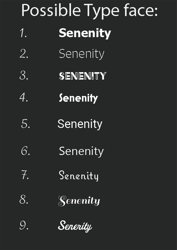
From looking at different typefaces these are the nine that I cancelled it down to. From this I showed it to my target audience to see what they prefer and what was more calming.  From the feedback, I received the most popular were, 2, 4, 5, 6, 7. From these I then picked the ones that I thought would be more appropriate. I agreed with them that 3 was not very calming, as it was very “in your face”, and 8 and 9 were too fancy, which meant that they could not really read them.

typeface2

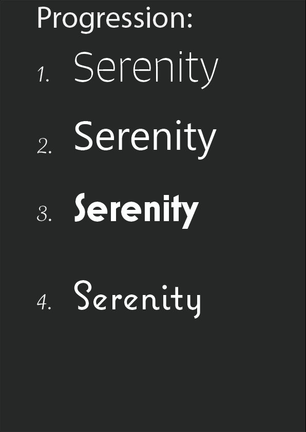
This was then the final 4 that I thought were appropriate from what the target audience had picked out. Personally, I think that either 3 or 4 would be a good title font to have as by having the S different gives it an interesting look. Also, I think by having the S different enhances it more, as S is a calming letter. Again, I got a few from the target audience to pick what would be a good title font and what would be a good body font.

typeface3

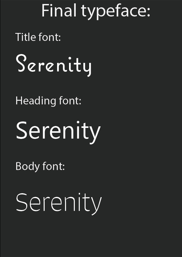
This is my final selection of font that I will be using for my product. I feel the title type face helps to differentiate itself and is a little quirky. The Heading font is clear and easy to read, which links into the body font. The roundness of the letter has a calming effect, which is simple to read.


I chose the title of Serenity, as it means the state of being calm, peaceful and untroubled. I feel this this represents what the product is aiming to do well, and explains what it does to the user. Also, I think that name is very interesting, and could draw the audience in.


Looking at type face

Research on Logos

apppp

Today I started off my research by looking at different kinds of mental health apps that are already out there, but I was mainly focusing on their logo designs. This is a page full of logo designs. Personally, I think they are very plain and simple. The simple part can be effective as, it is the easiest way to communicate to the user. The ones that I like the most are the green B, eCBT, Catch It, the sun one and Talks pace.  I like them because, they look the most modern and portray what the app does the most. The colour pallet seems very similar, with green, blue or orange. This must be because, they represent calming colours and orange for positivity. For my colour scheme I think I would like to stick with calming colours but have one colour that is positive as a dominate colour, this will help it to stand out more, instead of blending in the background.

From looking at these it has shown me that for the logo it needs to represent positive connotations as well as linking to my aesthetics. Also, I would like it to look fun, calming and modern, as this will entice my target audience.

Artboard 1


This is another mood board I made of logos of mental health that I really liked. They are very simple and have very efficient representation. My particular favourite in the tree at the bottom that looks like a brain. I think this looks very interesting as a piece of design and art, because it means so many different things. However, for a logo perhaps it maybe too intercut, and will not be as, effective on different platforms. I also really like the montage of heads with different art work in the middle as a silhouette. This looks really interesting, I think I would like to play around with a similar concept for my logo.

Research on Logos

Developing my proposal concept

My concept for this project has developed. Firstly, I changed the name of the product from Harmonize to Serenity. This is because, Harmonize has an underlying assumption that the product will be about music and harmonies, as a result I felt that it gave a misconception of what the app is really about. From this I then made a list of names with potential which were; Bloom, Synchronized, Serenity, and Rejuvenate. From this I then asked my target audience which name they preferred and what fitted the concept idea more. They chose Serenity. I was very happy with the name as it means, the state of being calm, peaceful and untroubled, this is the connotations that I wanted to portray within the product.

Also, the product developed more towards the app concept, rather than having virtual reality and augmented reality. I discovered from my research that virtual reality would not be suitable for he mental health issues that I was focusing on, as depression, anxiety and panic disorders are more organising their thought process, and virtual reality would not assist this because, they are escaping to an artificial world, and from papers I have read it is better for them to practice new techniques within reality. Also, from looking at what is available to my target audience, VR is very hard to be accessible to everyone, as this technology is very exclusive. Augmented reality did not work for my concept idea, as I originally thought about having an AR human talking them through muscle relaxation or breathing techniques, but I thought that this would be better for an older target audience, for them to feel more engaged, but for my target audience, they are mainly focusing on teaching them a more positive way to think, and how to develop a healthy mind.

Developing my proposal concept