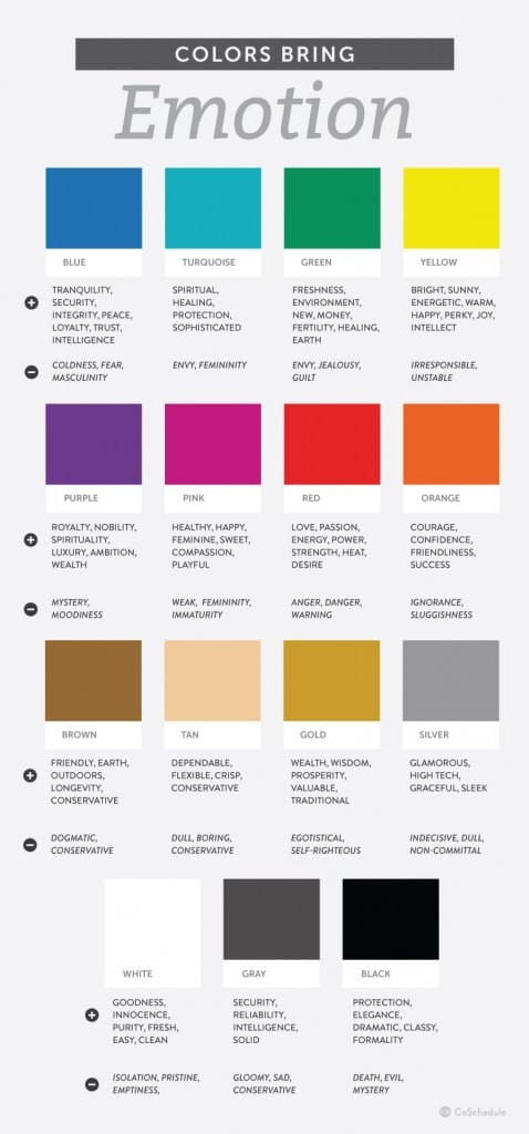
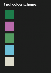
We deciding the colour scheme for my project, I first did a little research on the different type of emotions that they represent, as this will help me decide what will be the best colours to aid being calm and positive. When looking at this poster I tried to mostly consider the positives as, this is all part of CBT, which is trying to look at everything in a more positive light.
Possible consideration of colours:
Blue – this represents tranquility, security and peace. This would be helpful as, these are three aspects that calm a person, knowing that they are safe and in a calming environment.
Green – Healing is the key word that caught my eye, as this is what the service is I am aiming to get to.
Yellow – Warm, Energetic and Happy. This will help to contrast the other colours as, it should bring happiness, this could bring their mood up.
Pink – Healthy, Happy, and Playful. Again, these colours can be used to juxtapose, from the green and blue to give a lighter heart look.
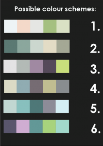
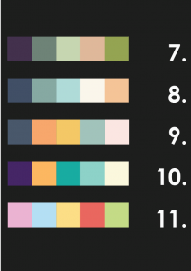
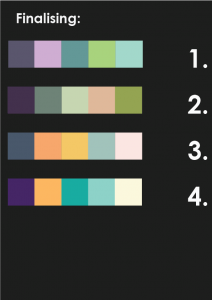
From this I then looked at different colour swatches that were both calming and happy. I found this quite hard to look for as, sometimes the colours did not go together, or they were way too dark and looked depressing. From the eleven I found, my target audience then went through and told me which swatches they liked the best. This lead to the final four. These swatches are quite similar in a sense, as most of them feature greens and blue. However, I feel that 4 maybe too brightly coloured and could look quite dated. 3 I am not sure on the about the two different types of oranges in there. In 2 the purple maybe too dark, but the use of the lighter orange could contrast that. With 1 the colours are quite similar, which means they will blend together easily, and one colour will not stand out from the rest.
From deciding that the final four still needed work, I mixed the colours up that I liked and thought went together into a new swatch. I think that these colours complement each other well, as I had two darker shades of green and purple to contrast the lighter shades of green and blue. This means that the lighter green and blue could work well as background colours while the darker colours could be used as texts to stand out. The cream colour is useful, as it helps to separate the dominate colours, and goes well with each one. I showed this final one to my target audience, and they agreed that it was the better choice.
