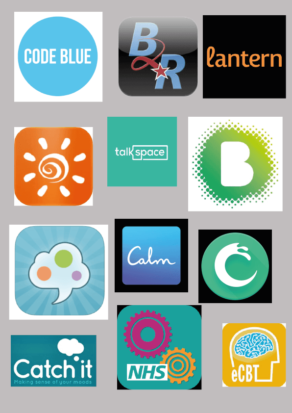
Today I started off my research by looking at different kinds of mental health apps that are already out there, but I was mainly focusing on their logo designs. This is a page full of logo designs. Personally, I think they are very plain and simple. The simple part can be effective as, it is the easiest way to communicate to the user. The ones that I like the most are the green B, eCBT, Catch It, the sun one and Talks pace. I like them because, they look the most modern and portray what the app does the most. The colour pallet seems very similar, with green, blue or orange. This must be because, they represent calming colours and orange for positivity. For my colour scheme I think I would like to stick with calming colours but have one colour that is positive as a dominate colour, this will help it to stand out more, instead of blending in the background.
From looking at these it has shown me that for the logo it needs to represent positive connotations as well as linking to my aesthetics. Also, I would like it to look fun, calming and modern, as this will entice my target audience.
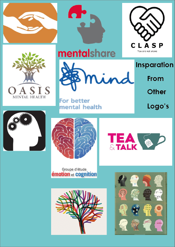
This is another mood board I made of logos of mental health that I really liked. They are very simple and have very efficient representation. My particular favourite in the tree at the bottom that looks like a brain. I think this looks very interesting as a piece of design and art, because it means so many different things. However, for a logo perhaps it maybe too intercut, and will not be as, effective on different platforms. I also really like the montage of heads with different art work in the middle as a silhouette. This looks really interesting, I think I would like to play around with a similar concept for my logo.