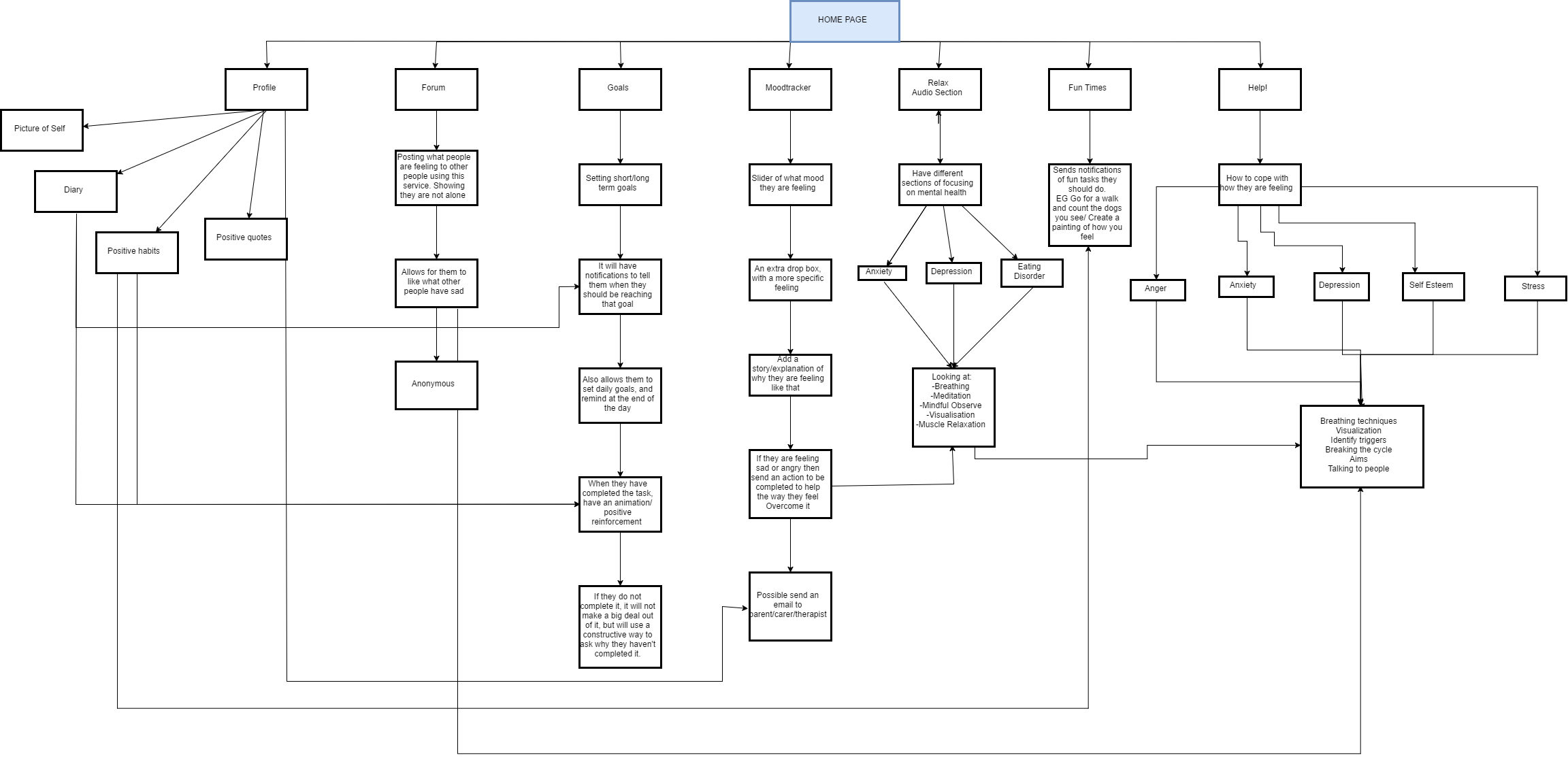
This is a flow chart, to help show the functionality of my product, and how everything is lined together. This will help me figure out what the sequence of interfaces should be. Also, it is better to help organize myself.
This is a flow chart, to help show the functionality of my product, and how everything is lined together. This will help me figure out what the sequence of interfaces should be. Also, it is better to help organize myself.
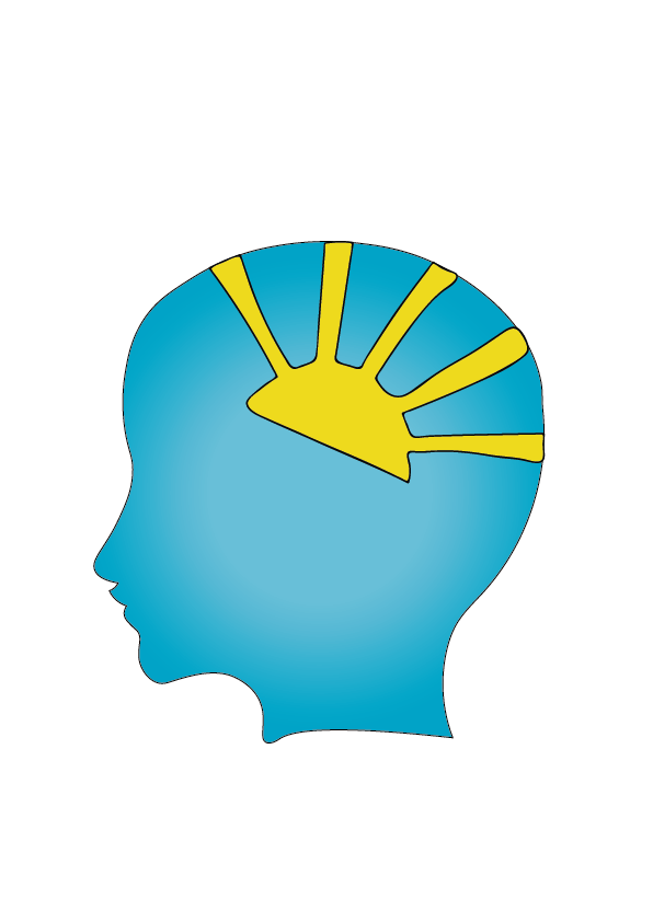
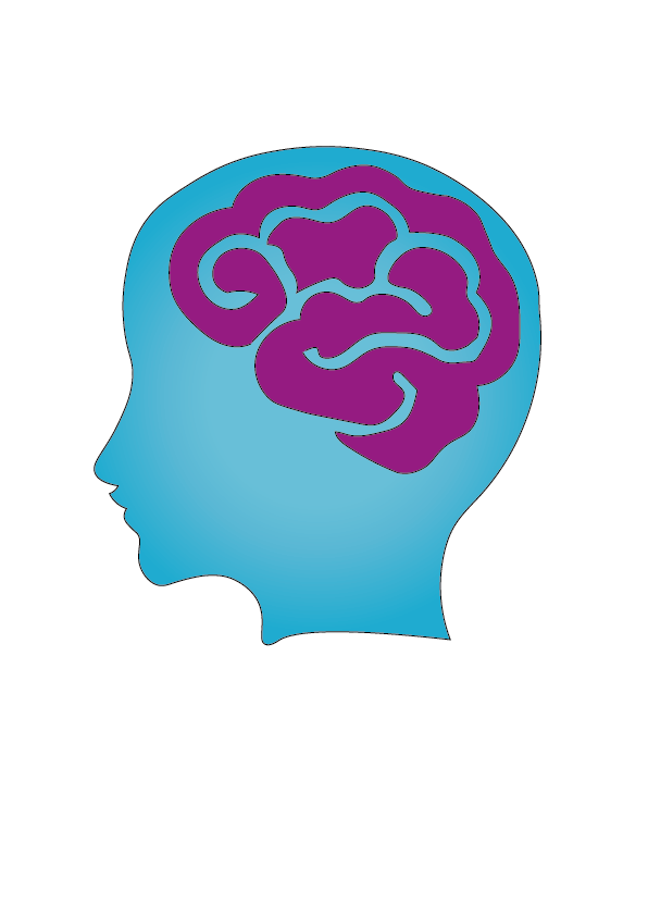
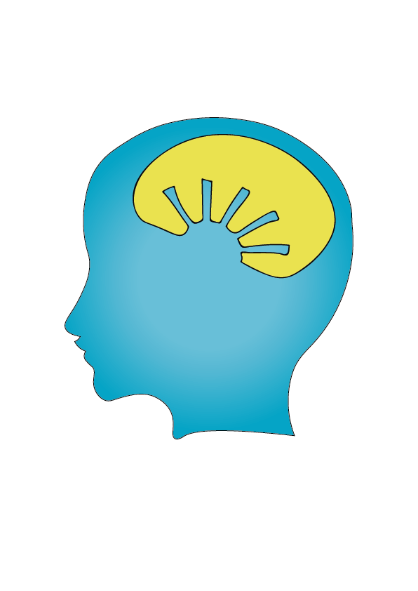
I carried on exploring different designs for the logo, and thought that the head was still a good idea. However, for this one I went with a different outline of the head. I do feel that this make it look more modern and was better than the previous head designs that I did. To make it look more interesting I wanted an object to go into the brain area. I first though what could be optimistic or thinking of more positive ways of thinking. For the first one I put a sun inside the head, as this has all the positive connotations to it. Also, I made it a half sun to make it look like a sunrise, so it links with new beginnings. However, my drawing of the sun isn’t very good as the sun beams are not even, and some are wonky. This could be improved more, by tweaking the beams so they are all equal and look more professional. The second on is a brain, this is a very simple representation of mental health, as it shows that this product with focus on the way that they think. I think the brain looks ok, but could still use some more tweaking. However, I feel that this is very boring, and not inventive, if you out this against other app logos then you would not notice it as, it will look the same as the others. From this I want to keep working. Lastly, the third one I designed, was developing on from the first one. Instead it is more of a silhouette of the sun in a brain shape. I thought that this was a cool concept idea, as it looks on positive thinking, which links to the CBT. However, as I got this from my first design, the sun outline needs more work and finessing, but also the outline of the brain could be enhanced more to actually make it look like a brain, instead of an oval shape.
Research on interface design:
To ensure I create a modern interface design that is appropriate for my target audience, I looked in to the main aspects of design I need to remember to make sure it is user friendly.
Main focuses:
The structure – Design should organize the user interface purposefully, in meaningful and useful ways based on clear, consistent models that are apparent and recognizable to users, putting related things together and separating unrelated things, differentiating dissimilar things and making similar things resemble one another. The structure principle is concerned with overall user interface architecture.
How simplistic – The design should make simple, common tasks easy, communicating clearly and simply in the user’s own language, and providing good shortcuts that are meaningfully related to longer procedures.
The Visibility – The design should make all needed options and materials for a given task visible without distracting the user with extraneous or redundant information. Good designs don’t overwhelm users with alternatives or confuse them with unneeded information.
Feedback – The design should keep users informed of actions or interpretations, changes of state or condition, and errors or exceptions that are relevant and of interest to the user through clear, concise, and unambiguous language familiar to users.
Reuse – The design should reuse internal and external components and behaviours, maintaining consistency with purpose rather than merely arbitrary consistency, thus reducing the need for users to rethink and remember.
What are the main functions of an app:
What is the main information on the homepage:
The five pillars of interaction design:
When designing for a user I need to remember:
The two categories for interaction designs
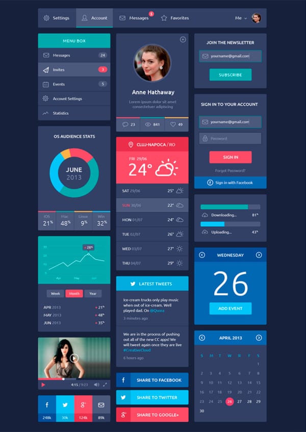
I really like the colours used in this design, it looks very sleek, and easy to follow.
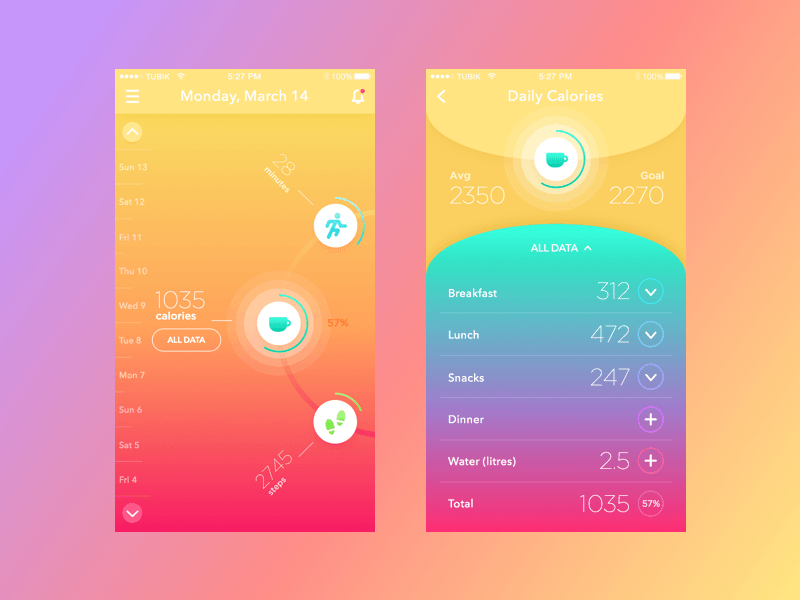
I really like this design, the gradient makes it look fun and attracts the audience to use the product.
I like the geoprint in the background, I think this helps it look more modern and differentiates it from other app designs. I think I would like to use an interface like this as it will appeal to my target audience more.
Bibliography
https://thenextweb.com/dd/2015/07/01/7-tips-to-create-awesome-mobile-app-designs/#.tnw_I2CUmUO6
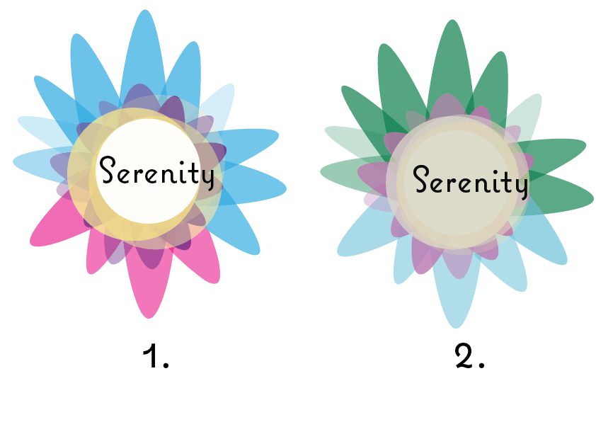
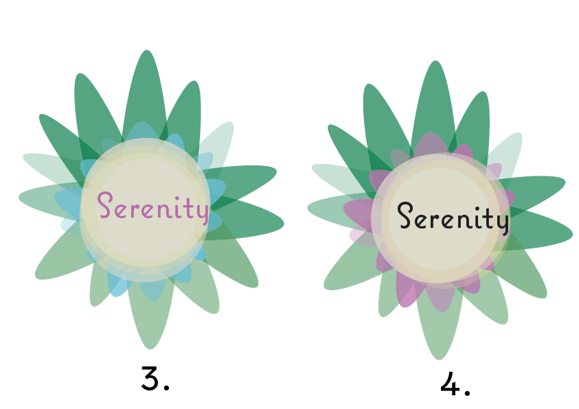
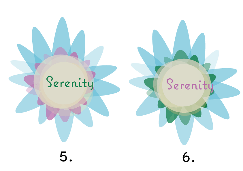
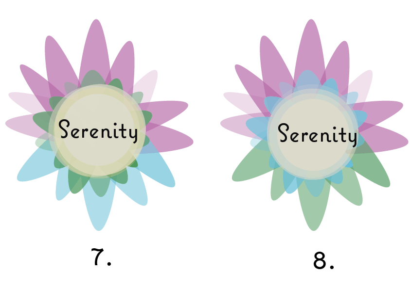
These set of designs were inspired, by lotus flowers and their connotations with peacefulness which links in with the title of the product. I tried to make it look like the inside of a lotus flower, like a bird’s eye view of it. All the 8 different versions are the same design but with different colour coordination’s from the colour scheme.
I asked my target audience which one they thought was better, they were stuck between 2 and 8, but after some discussion, they decided on 8.
I quite like this design, as I think it is very pretty, but also different to other logos I have seen for mental health. There is still more improvements that could be made to it, but so far I think that this would be suitable.