Author: Kayleigh Umfreville
App Logo
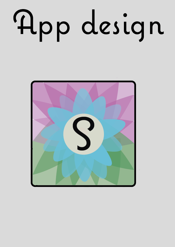
As I have decided that I am design an app, it means that I need to create an app interface that links with the logo and aesthetic of my design, as this will help to keep my branding similar. I knew that I didn’t want it to be the same as the logo, as I think this is boring as, is not what most companies do. They take the main feature/image of their logo or title and then develop that in to a app logo. For my project, I thought that I would focus on the lotus flower, as I feel this makes the app look different and more positive. When I started to develop my designs, I started off with the flower that I made for the logo, however when I put it in the app shape, there was a lot of random white space around the petals. I really didn’t like this as, it made the flower look really weird. My next step was to make the purple and green petals bigger. I feel this looks better that the first one, however, there is still plenty of white space. For the middle of the flower I thought that focusing on the S from the title would be good, as it links to the title of the product and the S is different from the rest of the word, which highlights it more, which means it would be easily recognizable. For the third one I thought that I would try how having the whole word would look it in. I do not like this as much as just having the S, as it does not fit just in the middle of the flower. Also by having the whole title it might not look as good, because and app logo is very small, so it will have too much to look at. On the forth one I organised the petals better so they took up the whole background. I like this a lot better as it looks more completed, and more professional. I tried it without having a S or the title to see if the flower will be more recognizable. I do really like it without the typeface, however, I feel that as this is a new app, then the branding needs to be established more for to become more recognizable. For example, Starbucks, there logo became less and less as it developed, as it become more universal. If my app reaches this level, then getting rid of the S will then become more appropriate. That is why for my final design I kept the S within the middle of the flower.

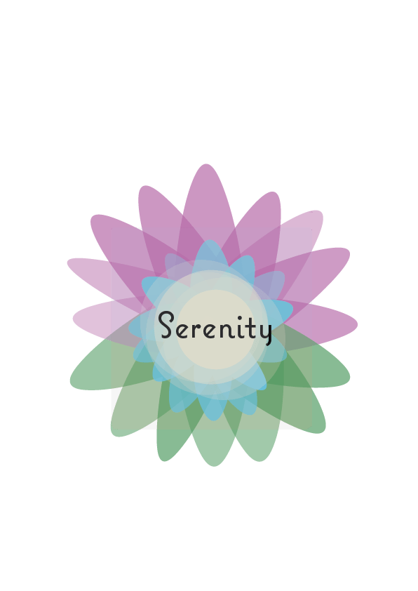
These images of the flower, I made to make sure I can then put them on other parts of the product, so they all link back together, for example when I make the style guide I can put these on there.
Finalising Logo design
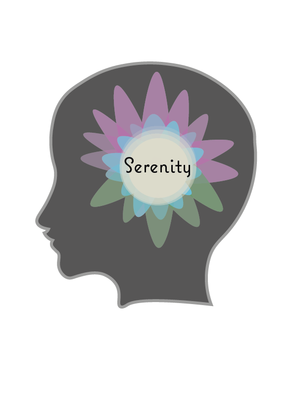
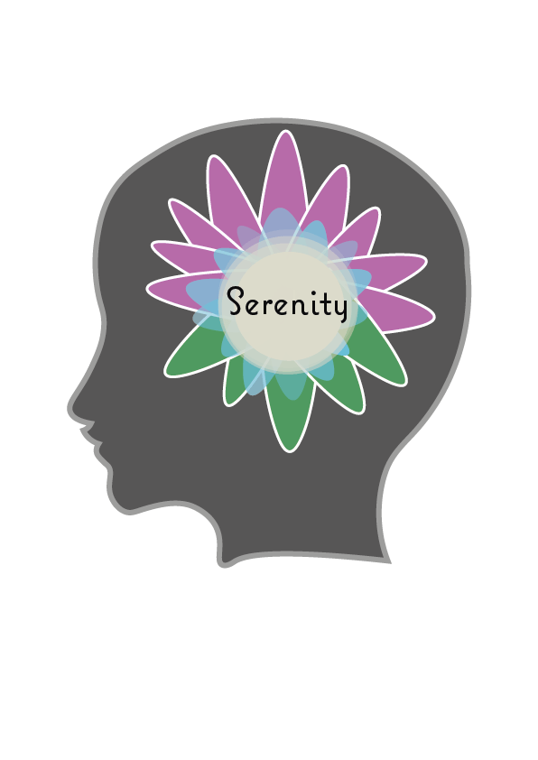
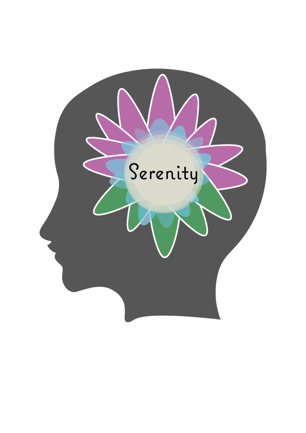
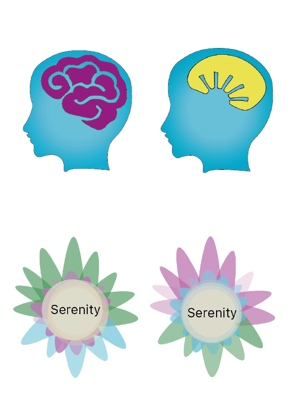
From developing the flower idea further, I thought I could combine my two main design ideas, and put the flower in the outline of the head. I tried it out and quite liked it. Then I asked for some feedback on what to improve. The suggestion I got was to have a lighter grey outline around the head, or have a white outline around the flower to help separate it from the head. I did both of these ideas, and showed them again, but they said it is better without any of the outlines. I think I am happy with design now, but I think it still needs a little more tweaking.
Budget
Planning on a basic budget:
When planning for a budget it is split up into different key areas; the direct costs, indirect costs, marketing, and contingency plans. The direct costs include; the hardware, software, materials, and travel. If the app that you are planning on creating is a one off, then the hard ware used could be rented. For my concept, I would have it on one platform to begin with, which would be an app, as it will first measure how it is working with the users, then I would develop it further if there was a demand for it, to add another platform, where data from the user is sent to their therapist or/and parents, so they can keep track of when they are feeling certain things that is worrying.
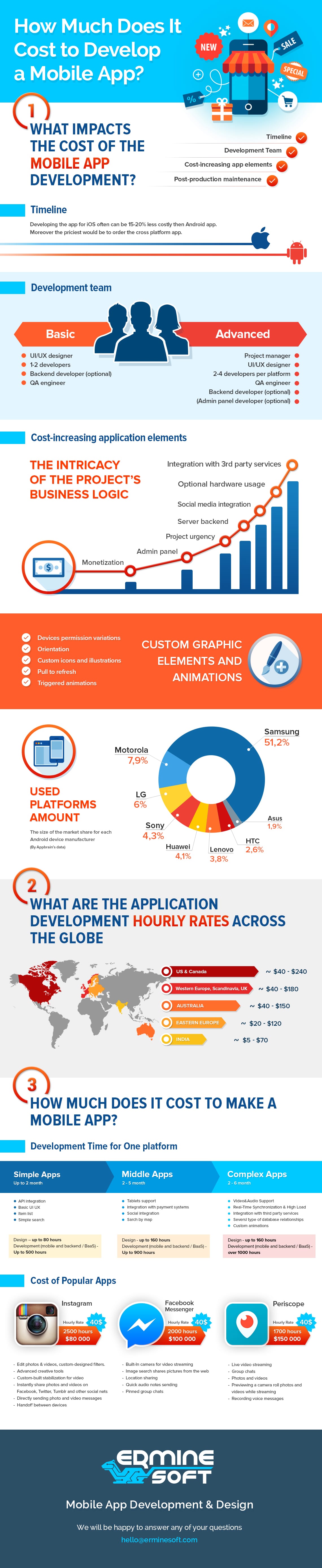
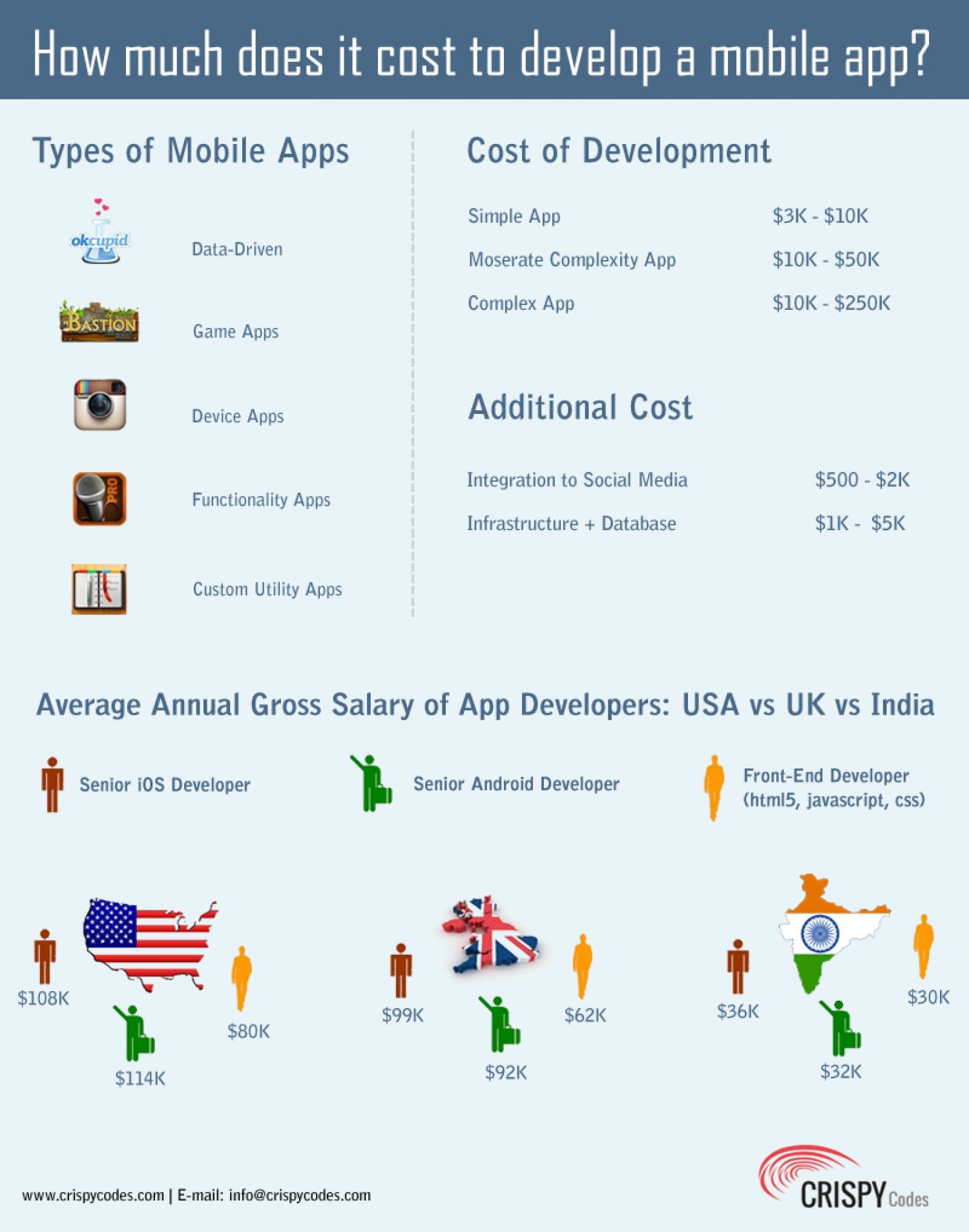
When planning out the cost of an app, it depends if it is a simple, data list, complex or an enterprise. The more complex the more expensive it will to develop the app, as the technology will increase. My app would be a complex, as it will need to have a bank of endless images to go with any visual idea the user has.
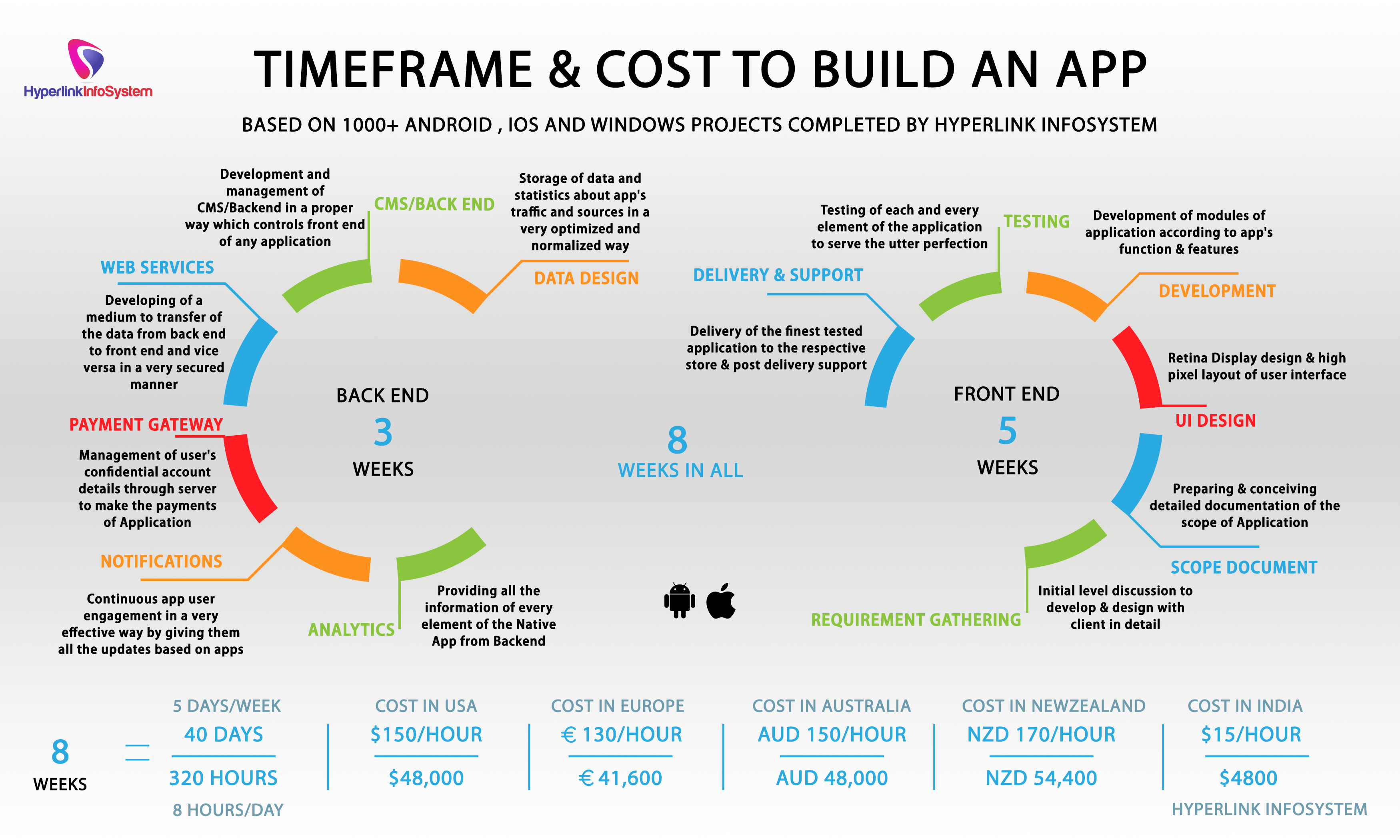
(What do these images show)
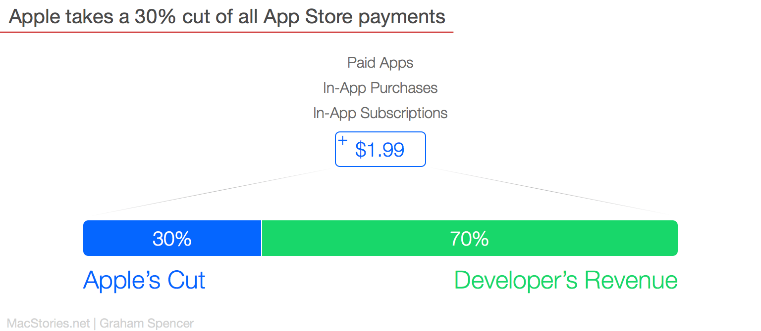
Also, when planning the budget, there must be consideration for the platform, I wish to sell my product. In my case, it would be through an app store, most likely Apple. Apple charge $99 to sell an app a year. Apple take 30% of the money from the price that is charged.
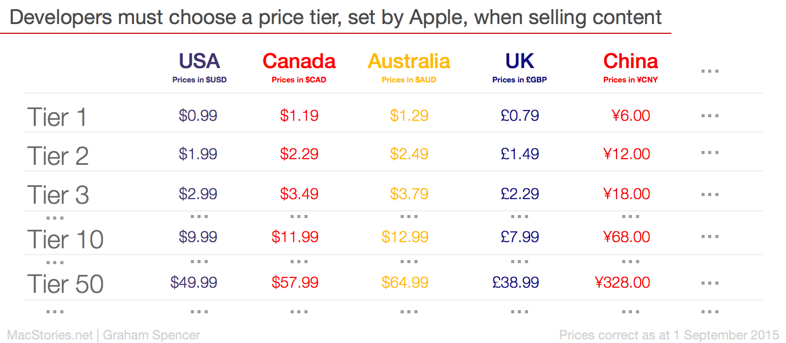 When choosing to price the app, will make it difficult as, I would want to make it accessible to as many people as I could. As a result, would mean that I would class this as a tier one, costing £0.79, which means I would only receive £0.55 from each app sold. On average the cost of the project is £40k, for the type of app I am aiming to design.
The rough pricing for developing an app:
Direct costs:
Hardware
-Mac/Computer ~ £1,049 (each)
-Iphone/ipad ~ £599
Software
-Adobe creative cloud ~ £45.73 a month including VAT
-Coding software such as iTunes connect ~ £81 a year

Indirect:
The Team:
- Project Manager
- Business Analyst
- 2-4 developers
- UX/UI designer
- Coder
- Backend Developer
- Admin
- Panel Designer
Their wages will all be based on their experience, but normally it will be based around £16k-£25k a year. Realistically the project should take around 10-12 weeks.

Other potential costs to consider:
- API integration
- Custom design components
- Application Developer
- Heavy tech components
- Admin panel development
- Marketing and promotion – normally companies spend around 5% of their total revenue on marketing
- Support & updates
- Frontend and Backend maintenance/BaaS subscription
- Cloud hosting
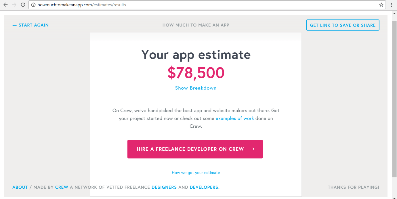
I did a test that asked me questions about the functionality of the app, then it calculated how much it would cost to actually make it with the best equipment and team.
Another element which is very important to consider, is a contingency plan. I thought of some possible scenarios that could happen within the production of the project and what the solution could be.
- A computer could break, or progress has been lost/deleted. If the computer breaks we could invest in another type of hardware that would be slightly cheaper, but still able to perform as well. Computers could be swapped around for when they are needed within the team to avoid buying anything more. Or if it is half way through the development then we could just rent the hardware. However, if the work has been lost/deleted, to begin with the work must be backed up onto the cloud or other hard drives, to avoid this ever happening.
- Development of the app could take longer than expected, this becomes a problem as it means that wage will have to increase, due to extra time, and any subscriptions for any software that we are using. As a result, when planning the budget it means that there must always be money put aside if this situation happens, as the manager will be able to still pay for the team to develop it.
Bibliography:
Hardware:
https://andybargh.com/hardware-needed-to-develop-ios-apps/
https://www.entrepreneur.com/article/223177
http://www.apple.com/uk/shop/buy-iphone/iphone-7
Software
https://developer.android.com/training/building-graphics.html
https://developer.apple.com/develop/
https://developer.apple.com/xcode/
https://developer.apple.com/ios/human-interface-guidelines/graphics/app-icon/
price for apps
https://www.macstories.net/stories/a-beginners-guide-to-app-store-pricing-tiers/
Closing down on logo ideas
From looking at all my previous designs and asking my target audience, these were the best out of all of them. From this I know that I need to cancel it down further to just one design, so I can continue to develop it. Out of all of them I think that the one that has the most potential is the forth. When i decided this i then got more audience feedback on what could be improved. I got; the typeface need to be more aligned in the middle, the green of the petals should be the lighter shade of green, and the petals maybe should be more equal. I am taking their feedback on board and will continue to develop this idea further.